Google UX Design Certificate
Portfolio Project 2:
Create a snack ordering website using Adobe XD
About the project:
Building on the first 5 courses of the Google UX Design Certificate program to create a responsive website in Adobe XD.
Project Overview
The product:
Snack ordering website for a nationwide movie theater chain.
Project duration:
September 2022 to February 2023
My role:
UX Designer and researcher
Responsibilities:
Paper and digital wireframes
Conducting User Research
Low and high fidelity prototyping
Accounting for Accessibility
Iterating on designs
The problem:
Concession lines can be long during peak times and not everyone has time to arrive early.
The goal:
Using Adobe XD skills to create a responsive website to allow users to order their snacks ahead of time whether on desktop or mobile.
Understanding the User
User research
Pain Points
Personas
User journey maps
User research
Interviews were conducted asking people who order food when going to the theater. The assumption that many people do not like waiting in queues was made. Another assumption was that ordering from concession did not impact the movie experience. After conducting research, many of the interviewees did not like waiting in line. However, some users said that waiting in line did add the the experience.
Summary
Pain Points
Time: Popular movies can cause long lines at concession.
Communication: May be difficult for some to make the right decision when ordering in person.
Persona: Annie
Problem Statement:
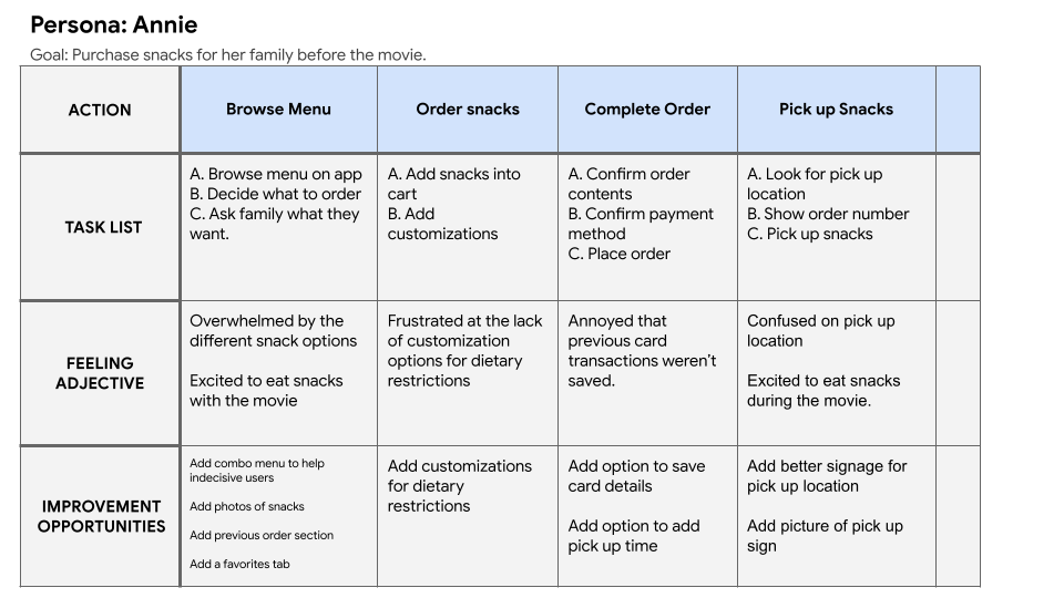
Annie is always busy due to her work and her two kids. She likes the idea of being able to have her food pre-purchased to avoid chaotic line ups at the theatre.
User Journey Map
Mapping Annie’s user journey shows how convenient it is to be able to order snacks ahead of time
Starting the Design
Paper wireframes
Digital wireframes
Low-fidelity prototype
Usability studies
Paper Wireframes
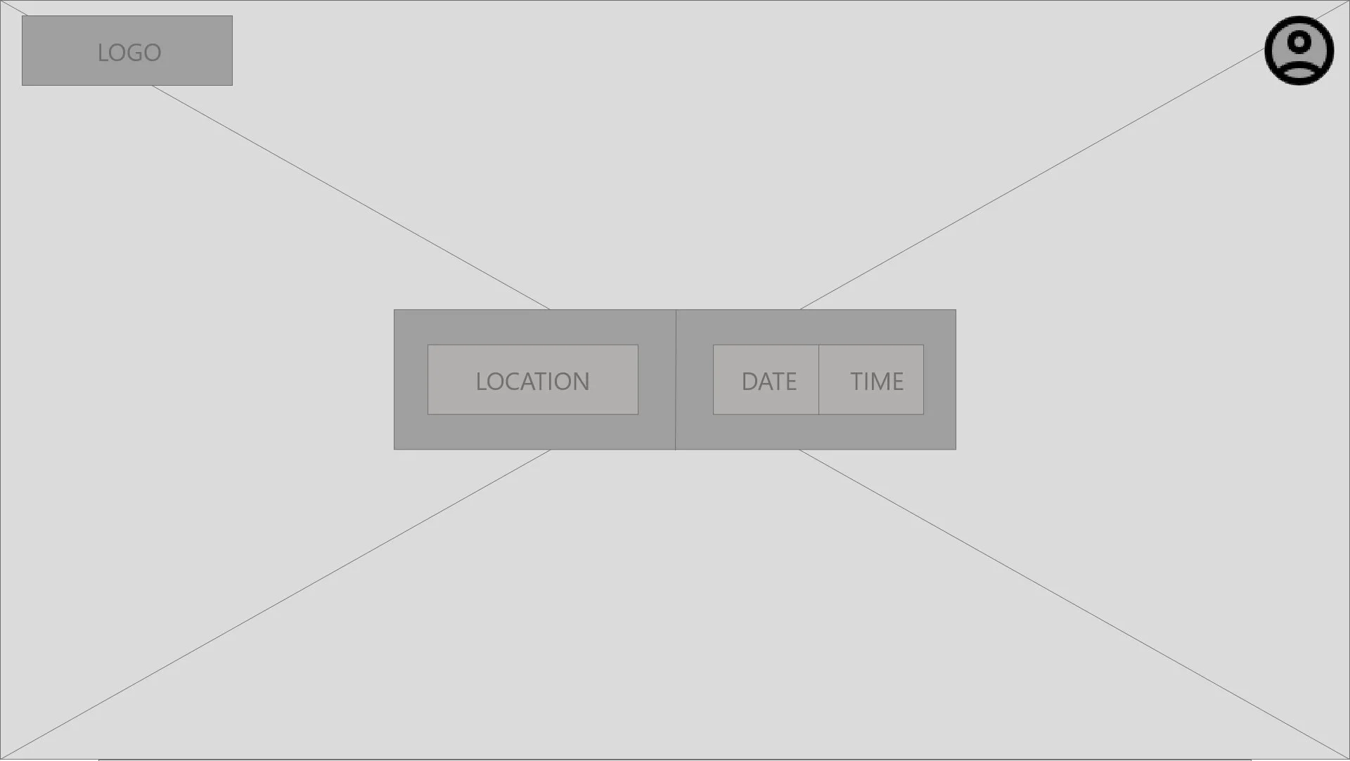
After many iterations, it was decided that having the location prompt at the top and a home bar at the bottom allowed for quick access to important screens.
Paper wireframes for the Menu
Paper wireframes for the Home Page
Digital Wireframes
By having the user log in before continuing to choosing the theatre to order from, the user flow is simplified and more intuitive to move through.
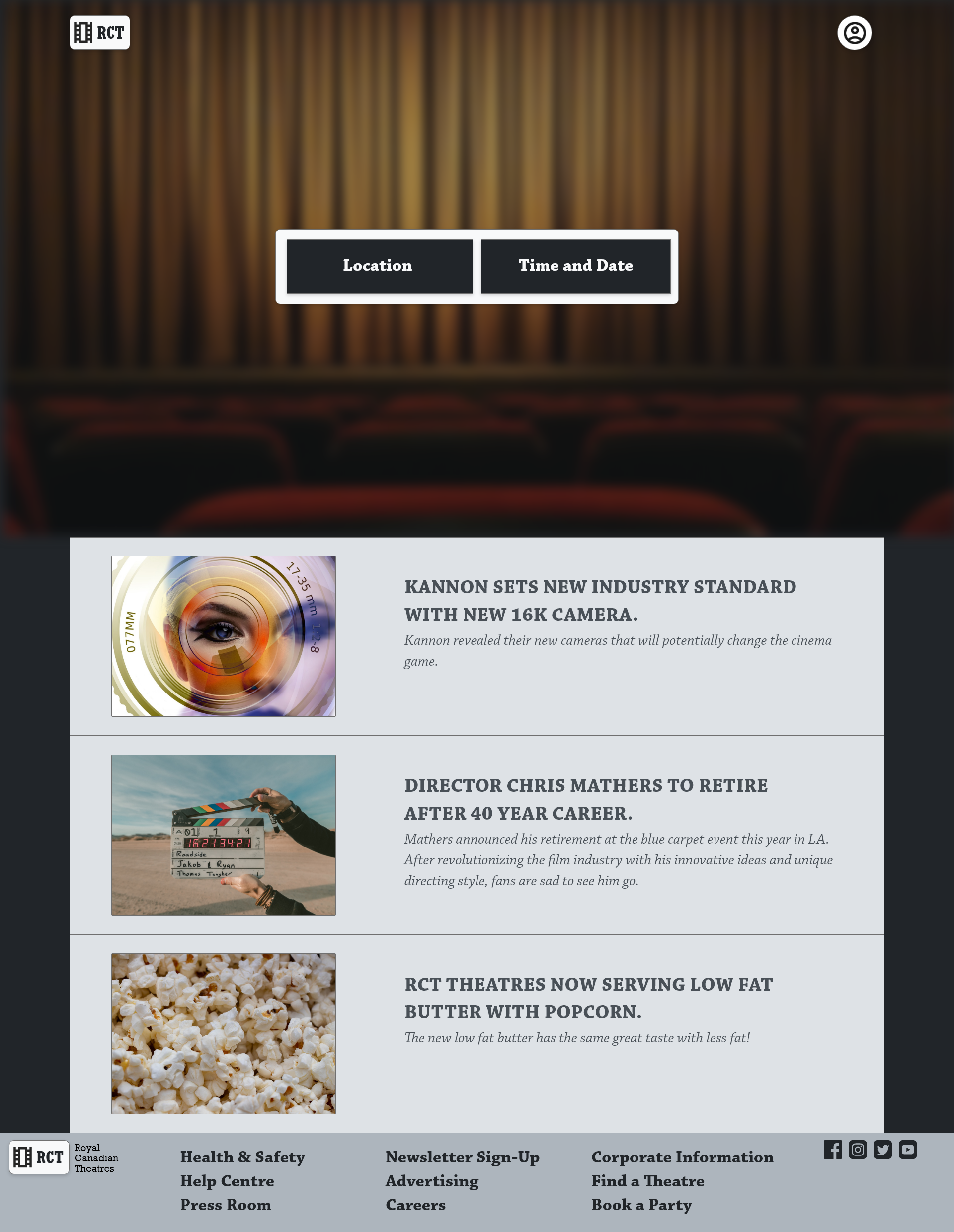
The website requires an account to continue
Once the user has logged into their account, they can proceed down the user flow.
The order screen allows the user to reach all available items in one place. Menu items are grouped into simple categories. Promoted items are accessible right from the start.
Location and Time are easily changeable from the top of the screen.
Search bar and simple categories allow the user to find what they’re looking for.
Low-Fidelity Prototype
User Flow: Ordering snacks for pick up through the website.
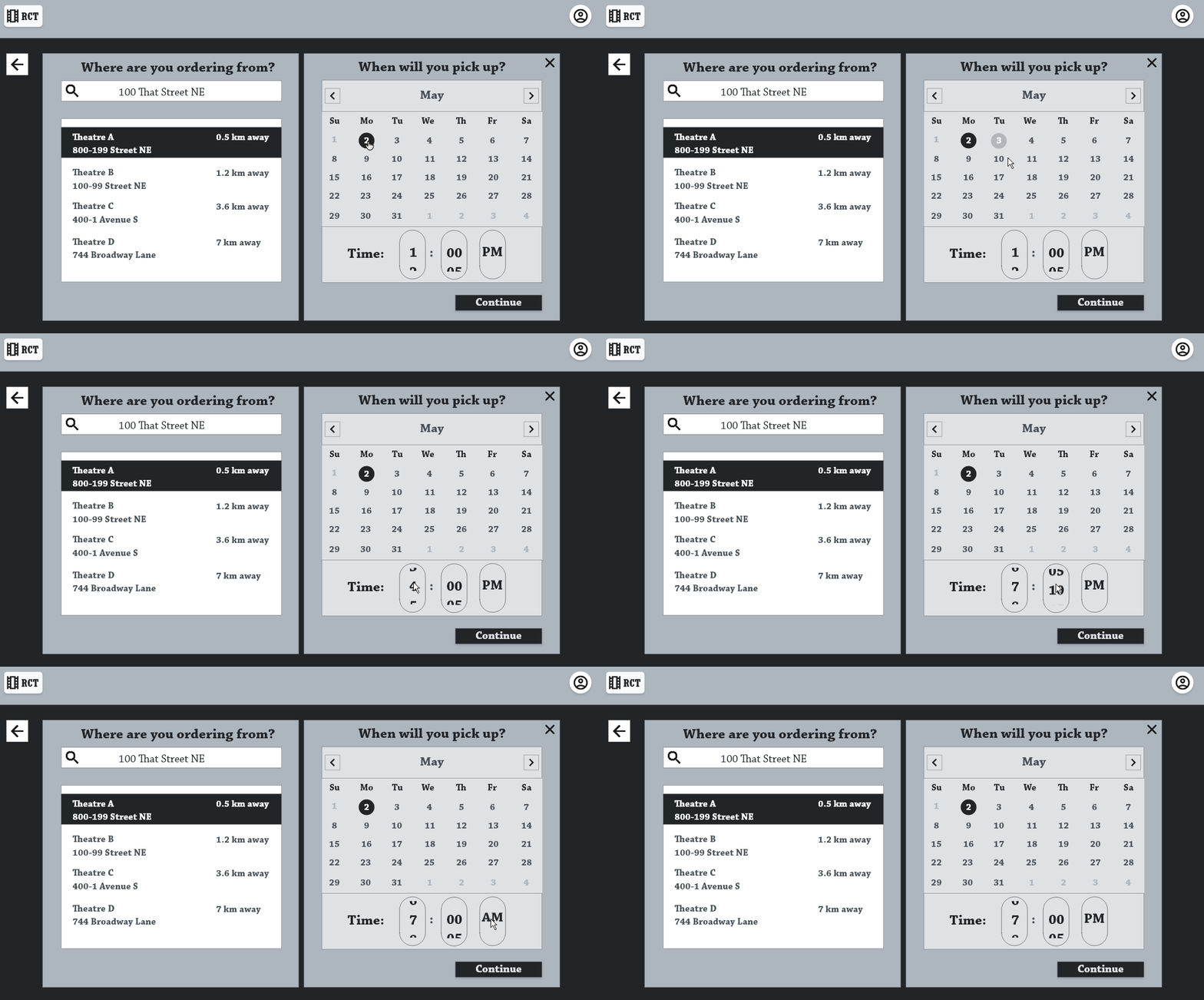
Available Actions: Logging in, setting location, date, and time, choosing items, pay confirmation.
The low fidelity prototype can be accessed here > Adobe XD Prototype
Usability Study: Findings
After one round of usability studies, we found that the overall design was straightforward. However, adjustments were needed for item selection and some navigation buttons.
Round 1 findings
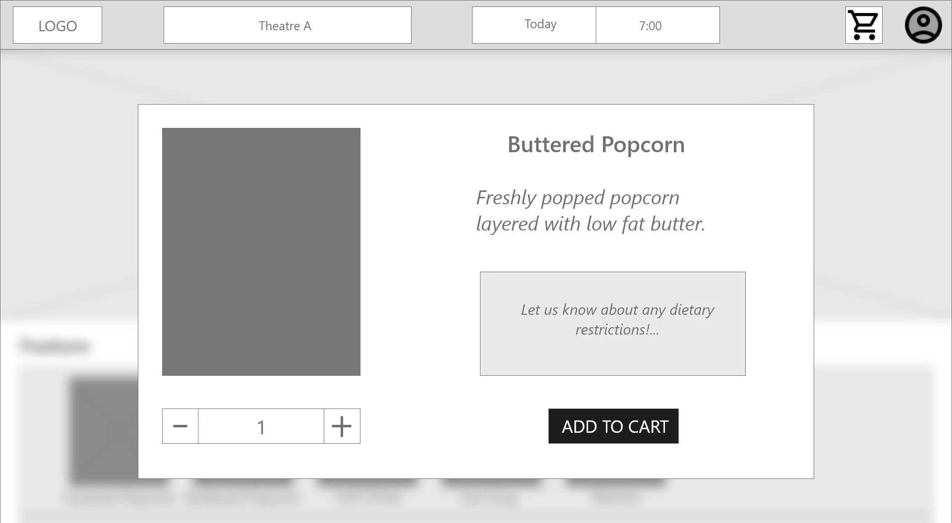
Users require predetermined selections when making adjustments to their food.
Users require call to action buttons to be more intuitive.
Users require more information to be available at a glance.
Round 2 findings
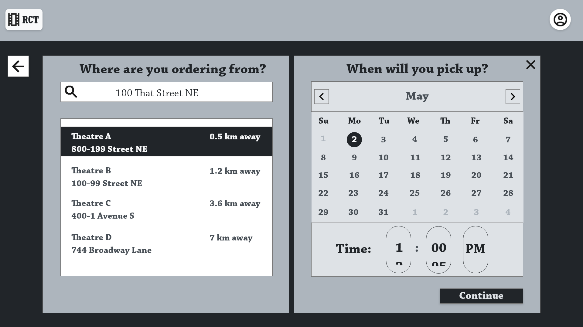
Users found that the time slider was not intuitive to use.
Users require a smoother transition from account creation to the home screen
Information highlighted in bold for users to be able to find crucial information with ease.
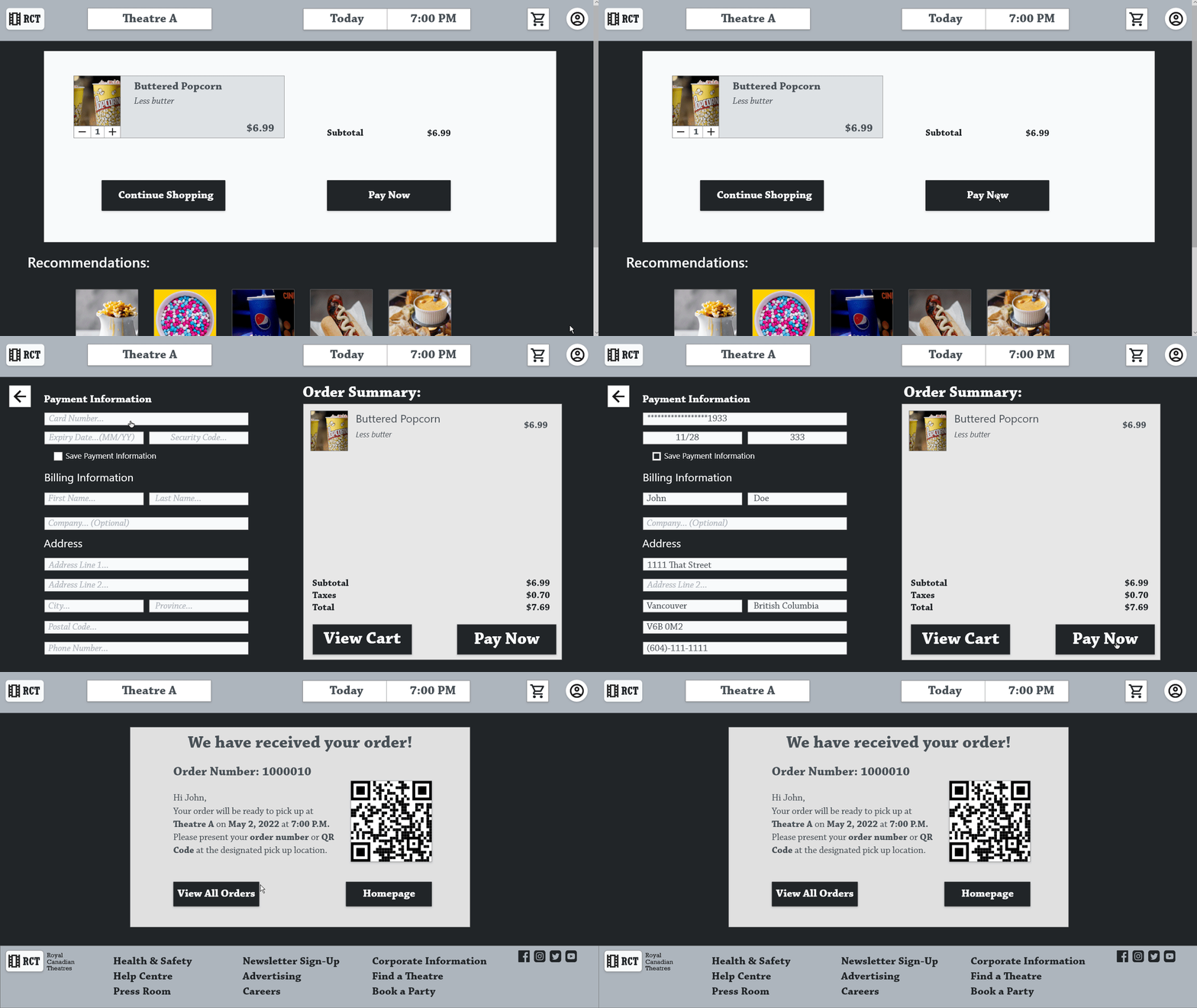
QR code easily allows for users to pick up with minimal error
The order confirmation page allows for the user to access information at a glance.
Refining The Design
Mock ups
High-Fidelity Prototype
Accessibility
Mock Ups
The design was kept the same after the usability study. Colors were kept simple and high contrast allowing for easier viewing.
After Usability Study
Before Usability Study
After Usability Study
Before Usability Study
A drop down menu was added to keep options simple for users. The dietary restrictions box was kept to allow for more specific requests.
Additional Mock Ups
High-fidelity Prototype
Available Actions: Logging in, setting location, date, and time, choosing items, pay confirmation.
The high fidelity prototype can be accessed here > Adobe XD Prototype
Accessibility Considerations
A linear path was used to keep the user flow as simple as possible. The user can focus on one task at a time.
Simple monotone and high contrast colors were used to increase readability.
Large images were incorporated for the visually impaired.
High-fidelity Prototype in Action
Going Forward
Takeaways
Next Steps
Takeaways
Impact:
The website is built for a simple streamlined flow allowing for users to place orders for their food before arriving at the theatre.
One quote from peer feedback:
“Everything was intuitive and simple to use.”
What I learned:
While designing the website, I learned that there are many ways that accessibility can be accounted for. Users like simple and intuitive designs which lead to a faster and more efficient user flow.
Next steps
Perform more usability tests to further refine the user experience. As the website becomes more complicated, I believe that further testing will be required to polish the final product.
A mobile version of the website will need to be finished. Usability testing will be done after the low fidelity prototype is finished.


