Google UX Design Certificate
Portfolio Project 1:
Create a snack ordering app for a movie theater
About the project:
Using what I learned from the first 5 courses of the Google UX Design Certificate program to create a snack ordering app.
Project Overview
The product:
A snack ordering app for movie theaters. Allows users to order snacks ahead of time to skip the line up.
Project duration:
December 2021 to August 2022
My role:
Lead UX Designer and Lead UX researcher
Responsibilities:
Paper and digital wireframes
Conducting User Research
Low and high fidelity prototyping
Accounting for Accessibility
Iterating on designs
The problem:
When blockbuster movies come out, the concession lines can get quite long.
The goal:
Users can order and pick up snacks without waiting in line.
Understanding the User
User research
Pain Points
Personas
User journey maps
User research
Interviews were conducted asking people who order food when going to the theater. The assumption that many people do not like waiting in queues was made. Another assumption was that ordering from concession did not impact the movie experience. After conducting research, many of the interviewees did not like waiting in line. However, some users said that waiting in line did add the the experience.
Summary
Pain Points
Time: Popular movies can cause long lines at concession.
Communication: May be difficult for some to make the right decision when ordering in person.
Persona: Stan
Problem Statement:
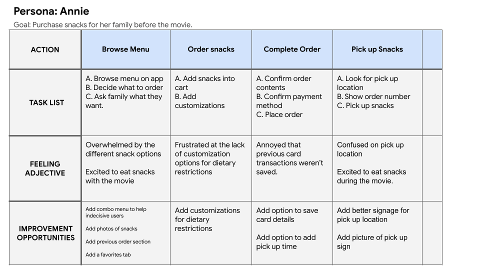
Annie is always busy due to her work and her two kids. She likes the idea of being able to have her food pre-purchased to avoid chaotic line ups at the theatre.
User Journey Map
Mapping Annie’s user journey shows how convenient it is to be able to order snacks ahead of time
Starting the Design
Paper wireframes
Digital wireframes
Low-fidelity prototype
Usability studies
Paper Wireframes
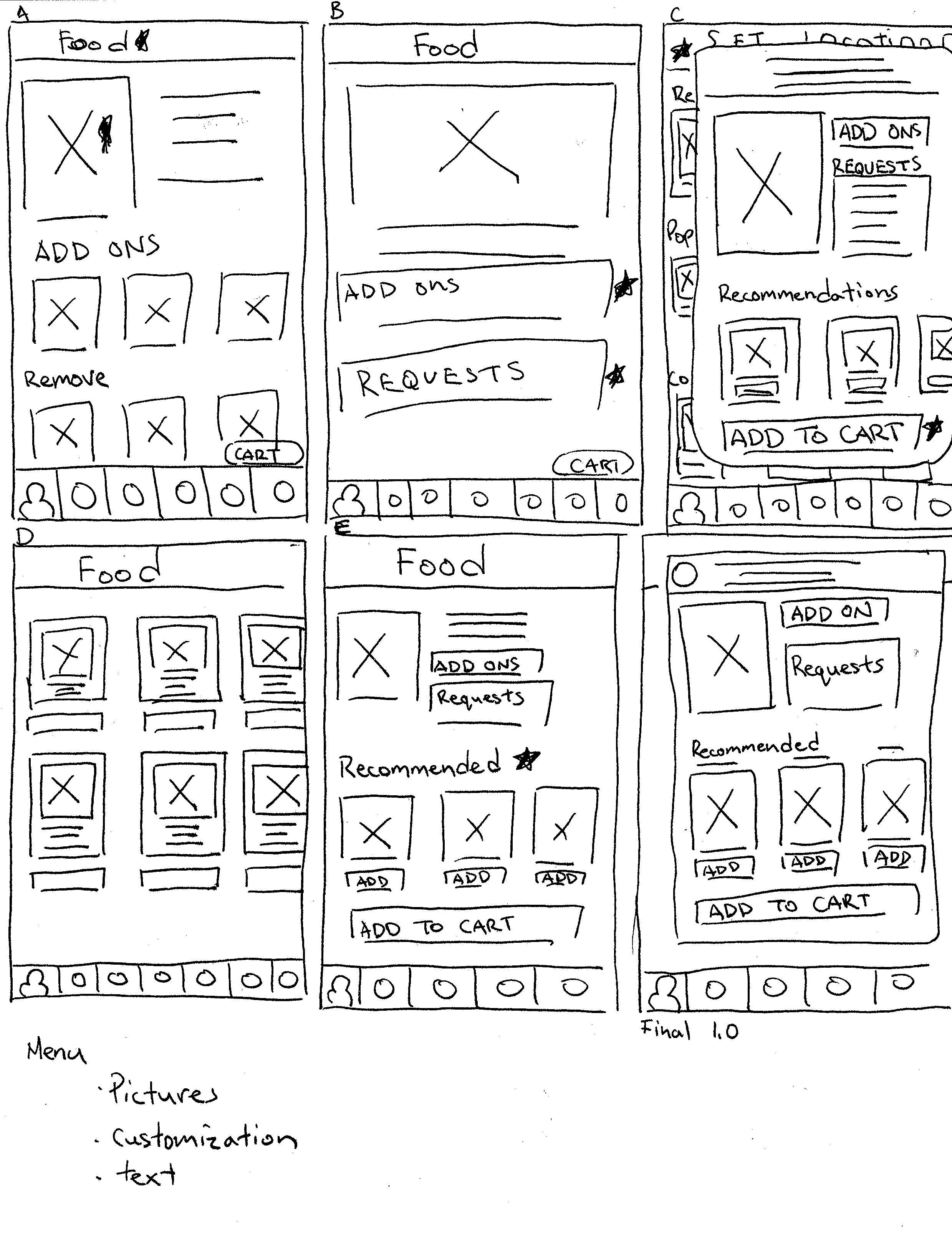
After many iterations, it was decided that having the location prompt at the top and a home bar at the bottom allowed for quick access to important screens.
Paper wireframes for the Menu
Paper wireframes for the Home Page
Digital Wireframes
The home page is made with usability in mind. Menu items can be seen at a glance. Recent items allow for quick access to previously ordered items. The bar at the bottom allows access to important user screens.
Location prompt allows for the user to change location easily
Recent orders allows for quick reordering
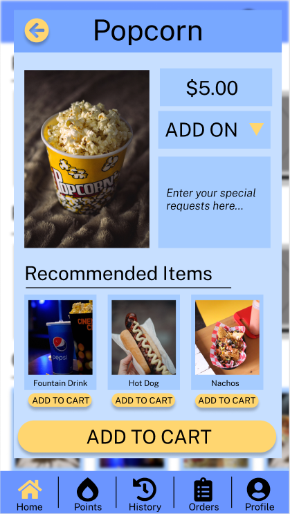
When a menu item is touched, a screen will pop up where the item is displayed with a large image, add on tab, special requests text area, and recommendations. By having the item pop up, the user flow isn’t disrupted by changing screens.
Large image of item to help with readability
Special requests area to fill in if user has dietary restrictions
Low-Fidelity Prototype
User Flow: Ordering snacks for pickup through the application.
Available Actions: Setting location, choosing items, pay confirmation.
The low fidelity prototype can be accessed here > Figma Prototype
Usability Study: Findings
After the first usability study, the overall design is flawed and requires adjustments. Users could not find certain buttons and were confused different parts of the design.
Round 1 findings
Users require more detailed categories and descriptions during snack selection
Users require the location setting to be more accessible and more intuitive to use
Users require the pick up time button to be in a more accessible location
Round 2 findings
Menu requires more information
There needs to be more confirmation screens
Colors need to be changed to increase usability
Refining The Design
Mock ups
High-Fidelity Prototype
Accessibility
Mock Ups
Early designs had the core concepts for design. After usability studies, I added color to match the theme and allow easier usage. A back button and page title were added for easier navigation.
After Usability Study
Before Usability Study
After Usability Study
Before Usability Study
The colors used help users see where to click on the screen. The language button allows the user to change to their native language.
Additional Mock Ups
High-fidelity Prototype
User Flow: Setting location, choosing items, pay confirmation.
The high fidelity prototype can be accessed here > Figma Prototype
Accessibility Considerations
The menu bar at the bottom of the screen allows for easy access to core features. There are both icons and words allowing for easier use of the buttons.
Large images were used in the design for the visually impaired.
The option to change application language for non-native English users.
Going Forward
Takeaways
Next Steps
Takeaways
Impact:
The app allows for quick and easy ordering of snacks before the movie.
One quote from peer feedback:
“The app is straightforward to use and I can’t wait to use it for real”
What I learned:
While design the snack ordering app I learned that it requires a bit more of thought for accessibility and that the more simple design, the easier it will be to make.
Next steps
Perform more usability tests to refine the user experience more. I think the user flow needs more work and could be simpler.
Conduct more user research to look for more opportunities to make the application more accessible for users.


