Google UX Design Certificate
Portfolio Project 3:
Design a User Experience for Social Good
About the project:
Building on the first 5 courses of the Google UX Design Certificate program to create a mobile app and complementary responsive website in Figma
Project Overview
The product:
Mobile app and website for a language learning application that helps users break the ice for picking up another language. Users have access to many different tools to help them learn another language.
Project duration:
May 2023 to July 2023
My role:
UX Designer and researcher
Responsibilities:
Paper and digital wireframes
Conducting User Research
Low and high fidelity prototyping
Accounting for Accessibility
Iterating on designs
The problem:
Sometimes it can be daunting to learn another language. It is hard to find a starting point and PolyGot was made to help users find it.
The goal:
Using Figma to create a dedication mobile app and a responsive website to allow users to begin learning a second language.
Understanding the User
User research
Problem Statements
Personas
User journey maps
User research
I conducted interviews to see how difficult people found learning another language is. Most interview participants were unsure of how to begin learning another language. Whether the user knew more than language or not, users who never learned a language studying by themselves had no idea where to start. The assumption was made that users didn’t know where to begin and the user research clearly supports it.
Summary
Persona: Emily
Problem Statement:
Emily is a university student who needs a language learning phone app because they want to read letters from her grandparents.
Persona: Rachel
Problem Statement:
Rachel is a flight attendant who needs a language learning phone application because they want to be able to learn on the go.
Persona: Ben
Problem Statement:
Ben is a retired senior who needs a computer to learn more languages because a phone screen is too small to read on.
User Journey Map
Mapping Emily’s user journey shows how simple and easy it is to begin learning through the app.
Rachel’s user journey shows how easy it is to learn on the go through the application.
Starting the Design
Paper wireframes
Digital wireframes
Low-fidelity prototype
Usability studies
Paper Wireframes
After many iterations, having the navigation bar hidden behind a hamburger menu allows for a cleaner looking screen and an increase in screen real estate.
Paper wireframe for the Homepage
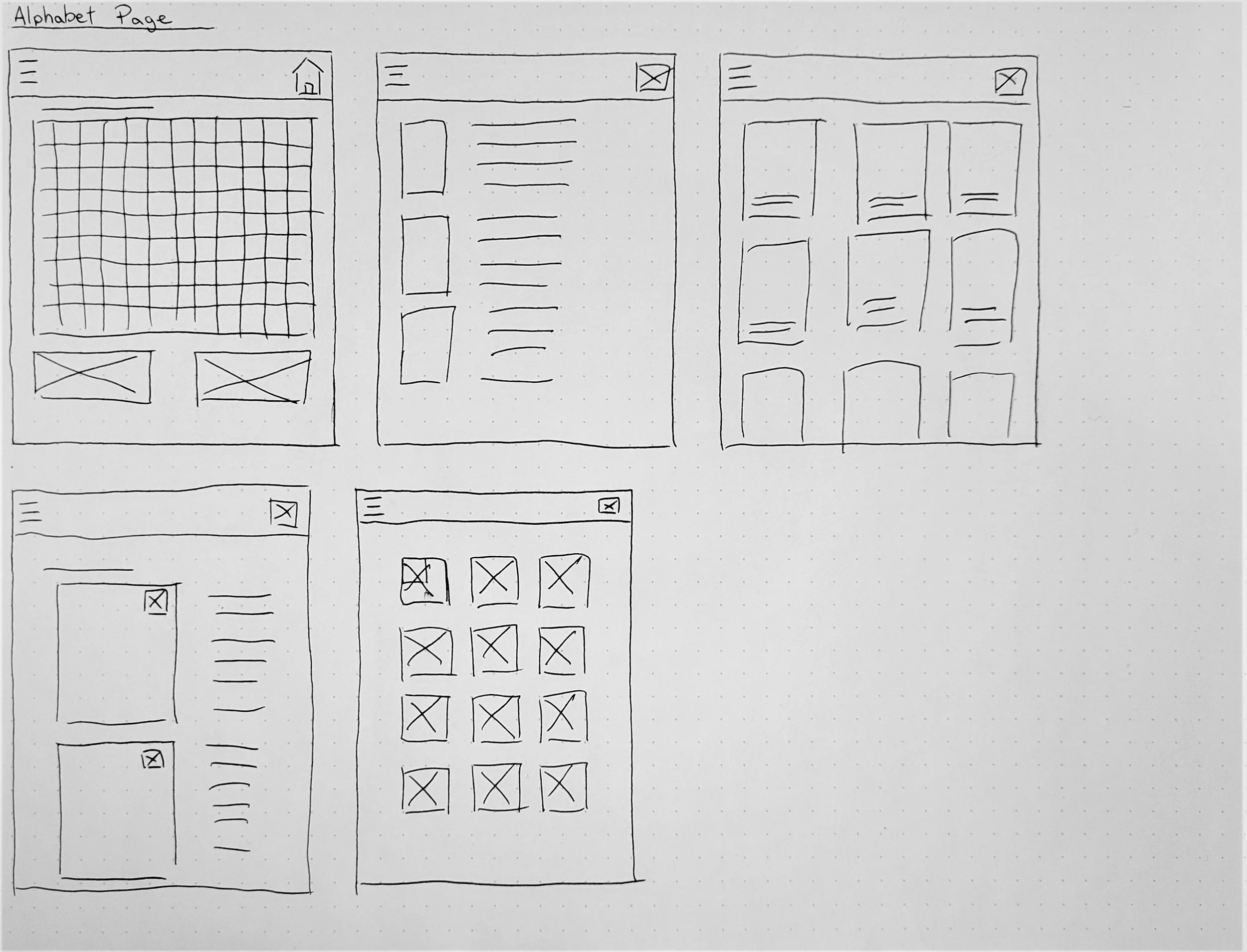
Paper wireframe for the Alphabet page
Digital Wireframes
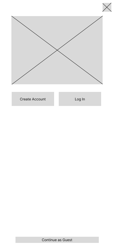
Account Creation
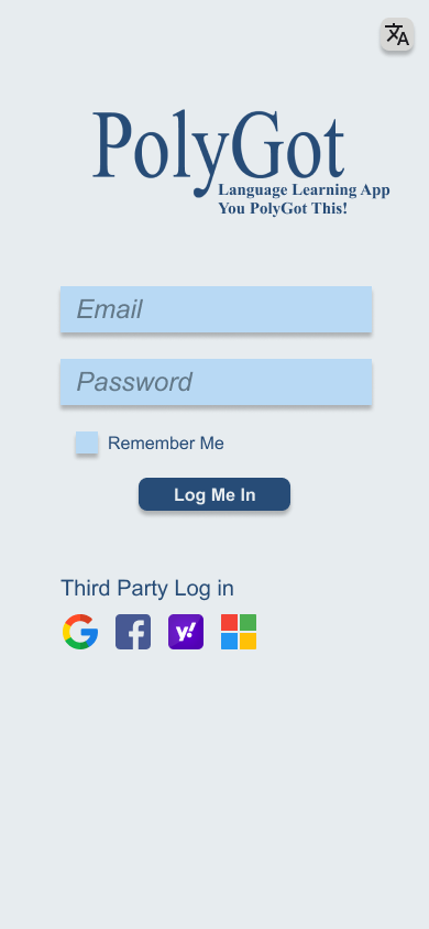
First time users will be greeted with a simple intro page where an account can be made or logged into.
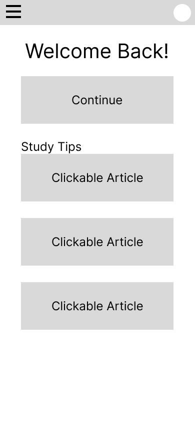
Homepage
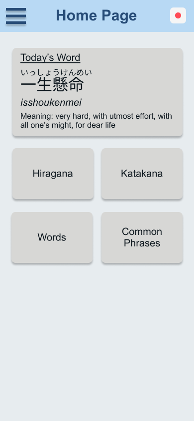
Simple home page allows for studying to resumed.
Having a simple login user flow allows for the user to jump right into the app. Users are able to use the app with or without an account.
Alphabet Page
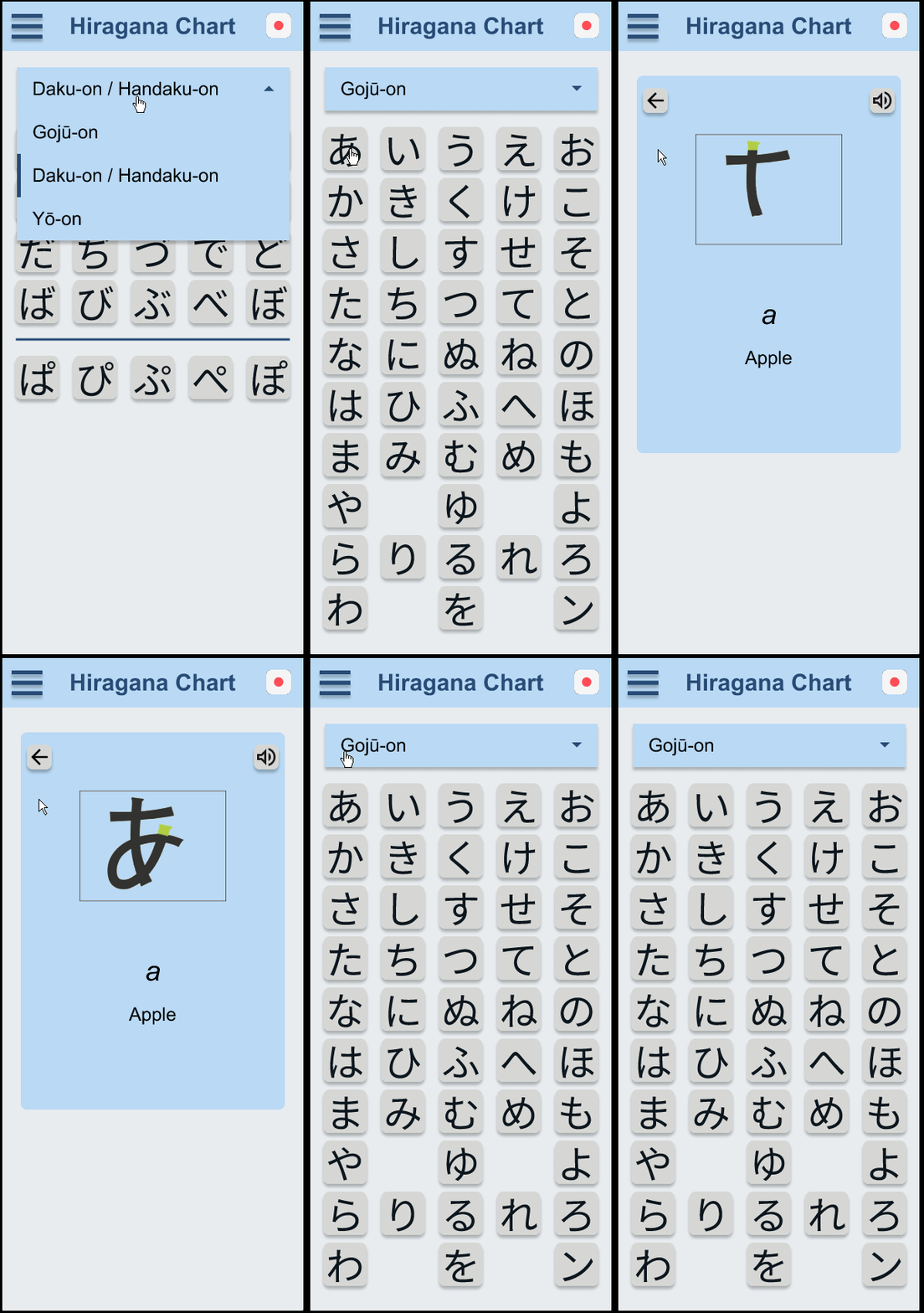
Users are able to see each alphabet character at a glance.
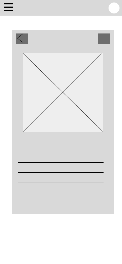
Selected Alphabet
Selecting a character allows for users to see important information about each character.
By having all the characters on display, users are able to select any character and learn more about it.
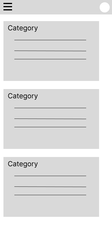
Vocabulary Page
Vocabulary is grouped together into categories
Selected Category
Selecting a category will show each vocabulary at a glance.
By grouping words into categories, users will be able to learn words
Low-Fidelity Prototype
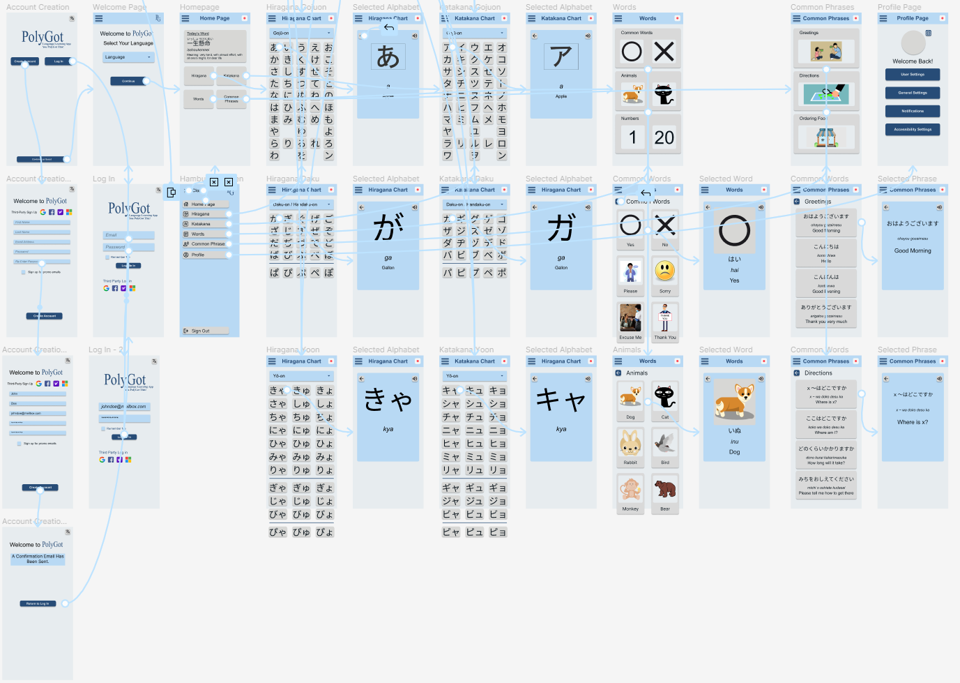
User Flow: Accessing each section for learning Japanese.
Available Actions: Creating account, logging in, selecting language, viewing alphabet, viewing vocabulary, viewing common phrases.
The low fidelity prototype can be accessed here > Figma LoFi Prototype
Usability Study: Findings
After one round of usability studies we found that the navigation needed to be simplified. Redundancy was achieved by added extra navigation to the home page.
Round 1 findings
Users require additional navigation options from the home page
Users require simple buttons on the home page
Users need more simple buttons in the hamburger menu
Refining The Design
Mock ups
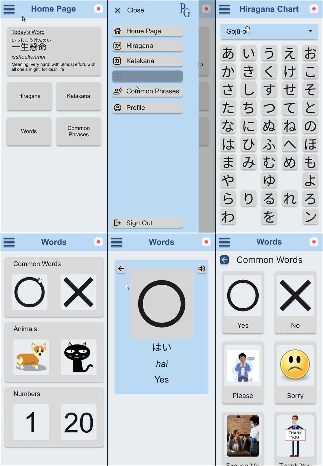
High-Fidelity Prototype
Accessibility
Mock Ups
After Usability Study
Before Usability Study
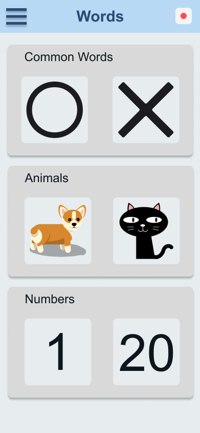
The design was not changed after the usability study, however the buttons were changed for a more smooth user flow. Extra navigation buttons were added to make navigating through the app easier.
After Usability Study
Before Usability Study
Images were added to each category to allow for easier interaction with the buttons.
Additional Mock Ups
High-fidelity Prototype
Available Actions: Creating account, logging in, selecting language, viewing alphabet, viewing vocabulary, viewing common phrases.
The high fidelity prototype can be accessed here > Figma HiFi Prototype
Accessibility Considerations
Large images were used for the categories and letters for the visually impaired.
Simple font and high contrast colors were used to increase readability.
High-fidelity Prototype in Action
Responsive Design
Information Architecture
Responsive Design
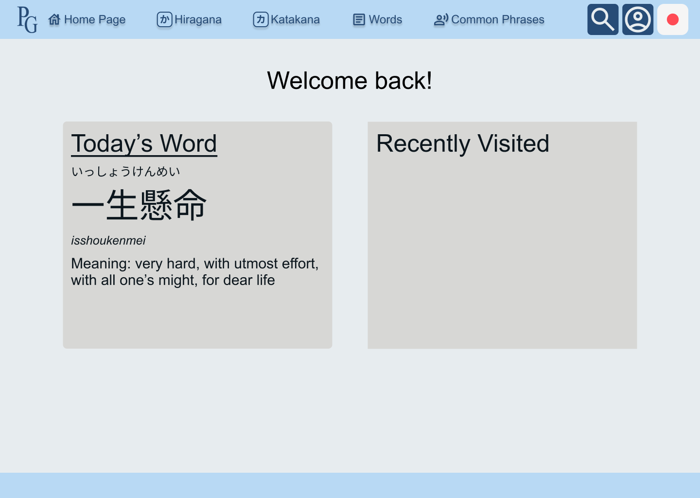
High Fidelity Prototype (Desktop)
Sitemap
I followed this sitemap to allow for a seamless flow between screens using the homepage as the starting point. Each page branches off the homepage but can be accessed easily from each other page.
Responsive Designs
Mobile
Tablet
Desktop
The designs for screen size variation included mobile, tablet, and desktop. Designs were optimized to fit each screen size
High-fidelity Prototype (Desktop)
Available Actions: Creating account, logging in, selecting language, viewing alphabet, viewing vocabulary, viewing common phrases.
The high fidelity prototype can be accessed here > Figma HiFi Prototype
Going Forward
Takeaways
Next Steps
Takeaways
Impact:
The application is built for easy navigation and simple user flow allowing for users to access the information they need to begin learning.
One quote from peer feedback:
“Super easy, pretty straight forward. Just like any other website or app”
What I learned:
While designing for both the application and responsive website, I learned that keeping things consistent and adjusting native functions between the different screen sizes was extremely challenging. Adjustments were needed to fully utilize the potential of each screen size.
Next steps
Add more tools for the user to learn. For example, a flash card option to help with review.
Increase the variety of categories and subcategories for users to learn more about a language.
Conduct more research on ways to polish the app and create an even better user experience.


